It is of interest to think about how the world has changed within one’s own lifetime, which becomes especially true the older one gets. However, we can also think about longer–term changes; and this especially applies to the wine industry, which has been around for a very long time (even in the so-called New World).
Recently, the AAWE presented vineyard acreage data for the states of the USA way back in 1880, based on Department of Agriculture Special Report no. 36 (1881). It occurred to me that it would be interesting to compare this to the same data for today. I report on the result here.
Unfortunately, this turned out to be much harder than I thought. There are plenty of web data on the number of wineries per US state, and also for wine production per state. However, no-one seems to care much about the source of the wine — the vineyards themselves. This same issue has been reported by Wine Folly, so I am not alone.
I managed to find some census data from the US Department of Agriculture (USDA) for 2017 (and also for 2002, 2007 and 2012). Sadly, the USDA has the most primitive data–search system that I have seen in the past couple of decades (and I have been dealing with this sort of thing professionally for 45 years), with very little in the way of user guidance. I eventually had to search for each state individually (data listed as “Acres bearing” in their database). So, I can only hope that I got it right. (This is one area where I am happy with the way the world has changed in my lifetime!)
The comparison data are plotted in the first graph, with the vineyard area in 1880 plotted horizontally and that in 2017 plotted vertically (note the exponential scale in both cases). Each point represents one state, with a few key ones labeled. The pink line represents equality, so that any state above the line has gained vineyard area over the 137 years, while those below the line have lost area. Those states plotted along the vertical axis had no area recorded in 1880 (13 states). There are also two states missing from the USDA dataset (Alaska and Wyoming): “withheld to avoid disclosing data for individual operations” (ie. there was only one vineyard in each state).
Note that California is still the top vineyard state, with New York also still near the top. However, back in 1880 Ohio and Missouri had the next two largest areas, but they have now dropped away seriously. In their place, Washington and Oregon have boomed. These changes, of course, reflect the pattern of changes in European–style cultural settlement, along with a recognition of which climates are best suited to wine–grape production (The forces behind Washington wine’s rise). For the rest of the states, there is very little correlation between the two sets of data (R-square < 2%) — that is, these changes in state vineyard areas have been pretty much random!
Note that the fourth point from the top of the left axis is the upcoming Colorado region, which has recently made it into the industry news: Colorado rising: behind the world’s first high desert hybrid wine region; Colorado’s wine industry is bringing economic growth to a state known for fun. So, changes are continuing.
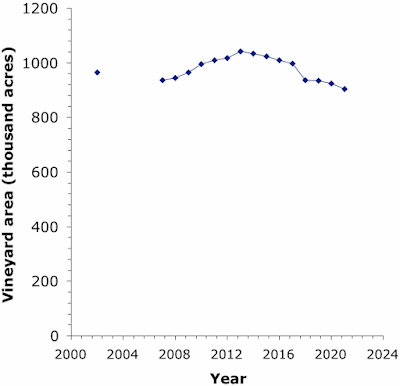
While on this particular topic, we can also take a quick look at the change in the national vineyard area through recent times (ie. the sum of the state areas). The USDA does have this information for all years from 2007 to 2021, plus 2002. These data are plotted in the next graph.
Note that the vineyard area has been consistently decreasing since 2013, so that the current area is the smallest it has been this century. This is usually attributed to official attempts to deal with a grape over supply problem (aka. “vine-pull” schemes). US wine sales are reported to have barely increased in the last four years (Wine treading water in US market), so that no new vineyards are needed (not even in Colorado). [World wine consumption is not much different.]
Therefore, for every new vineyard acre, the USA now needs to lose an old one, even if these are in different states.


No comments:
Post a Comment