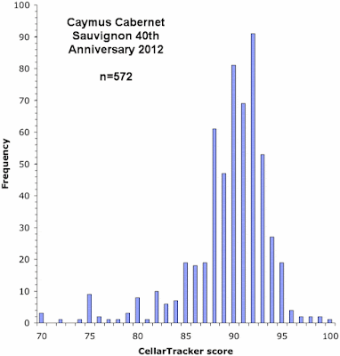
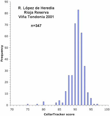
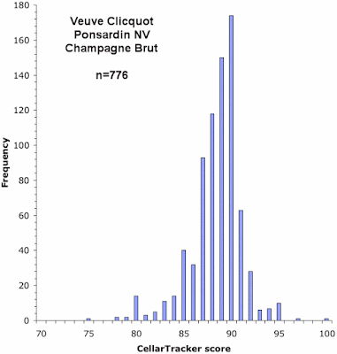
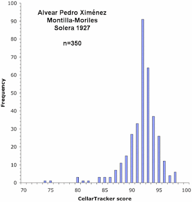
It seems to me that there are a few misconceptions about analyzing data, at least among non experts. I will discuss some of these over the next few weeks, and illustrate a few points with some real data from the wine world. Let's start with the vital idea that we should actually look at our data before we rush into any sort of formal analysis.
As the example, we will look at the recent publication by Vox magazine of an article entitled Why amateur wine scores are every bit as good as professionals’.
Statistics is a field of data analysis that calculates various summaries of a set of data, to help identify data patterns that are unlikely to have been produced by random chance. However, this can be no substitute for actually looking at the data, as well.
Statistical calculations summarize only some of the patterns in the set of data, and therefore the data analyst needs to be very careful about the interpretation of the statistics. It is depressingly easy to do a set of calculations that seem to point one way when the data clearly point a different way. It behooves the analyst to look at the data first — this is called exploratory data analysis. The classic textbook on this topic is by John W. Tukey (1977. Exploratory Data Analysis. Addison-Wesley).
A case in point is the recent publication by Vox magazine. The magazine performed a series of correlation analyses, and from these analyses they reached the conclusion that "amateur wine scores are every bit as good as professionals’." However, looking at their data, as displayed in their graphs, shows something quite different.
Vox collated data from thousands of wines, finding the quality ratings from each of four sources: Cellar Tracker (as an example of wine ratings by non-experts, or amateurs), and the Wine Advocate, the International Wine Cellar, and Jancis Robinson (representing the diversity of ratings by professionals). These four rating systems were statistically compared by calculating spearman correlations among the ratings, pairwise. Check out the original article if you are unfamiliar with this type of analysis, which is quite standard for this type of data.
Let's look at the first Vox graph as an example. This shows a direct comparison, for the same wines, of the (average) quality
scores from Cellar Tracker (vertically) and the (single) score from the Wine Advocate
(horizontally). Each point represents a single wine (there are nearly
10,000 points in the graph). As an aside, to be correct the graph should actually be square, since it compares two things on nominally the same scale, and yet it is rectangular, instead. This is not a trivial point, because the graph distorts the data display — this is the first hint that something might be wrong.
I have provided an annotated version of the Vox figure below, to illustrate the points I am about to make. You can check out the unadorned original here.
The two scoring systems seem to agree for wines rated at >84 points (on the standard 50-100 scale). That is, both systems agree that the high-scoring wines deserve 84 points or more. How much more? Well, the Wine Advocate uses scores from 84-100, but Cellar Tracker rarely uses scores greater than 97. So, that is a kind of agreement, but not necessarily a very large one — a score of 90 on one scale is not necessarily a score of 90 on the other scale.
However, the graph also clearly shows that there is no agreement whatsoever below a score of 84, or so. The wines that the Cellar Tracker raters like are ones that the Wine Advocate dislikes (top left of the graph), and vice versa (bottom right of the graph). Moreover, there are no wines that both rating groups agree deserve low scores — these should be in the bottom-left part of the graph. Agreement between the raters requires some points in the graph both at the top-right and the bottom-left, but the latter are missing.
So, I am tempted to suggest that this is actually a prime example of disagreement between two ratings, possibly the most blatant one that I have seen in 40 years as a scientist.
As a data summary, the statistical correlation value is clearly meaningless — it completely misses the most obvious patterns in the data. That is, there are two clear patterns: (i) wines that are rated highly on Cellar Tracker and (ii) wines that are rated highly by the Wine Advocate. Often, these are the same wines, but sometimes not; and there are no wines that are rated poorly by both groups of raters.
The practical problem here is that there are two patterns in the data, whereas the summary consists of only one number — there is no practical way to get two pieces of information into a single number and then extract that information again. So, the mathematical calculations focus on a single pattern, which turns out to be a compromise between the two main patterns, and therefore does not correspond to either of them. As we all know, sometimes a compromise means that no-one gets what they want!
All of the graphs in the Vox article show this same two-pattern feature to one extent or another (only five of the six possible pairwise graphs are presented). This means that this is a general issue with the Vox analysis, rather than something specific to the Wine Advocate ratings.
I therefore cannot agree with the conclusions reached in the Vox article, based on the data analyses that they present. Looking at the data first would indicate that the correlation analysis is inappropriate as a summary of these data sets, and some other analysis is required.
Note that this does not mean that I think community scores are in any way useless. Indeed, I use them all the time, myself, because they have considerable practical utility. What I am saying is that the data analysis presented by Vox does not actually support their conclusions — community scores are not the same as professional scores. Indeed, why see either type of score as necessarily superior? Why not see, instead, they are equally useful because they are different?
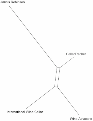
Finally, what if, for the sake of argument, we decide that we do accept the Vox correlations as meaningful summaries of the data? What are these summaries telling us? I recently showed a network analysis based on exactly these same type of data (Summarizing multi-dimensional wine data as graphs, Part 2: networks). So, we can perform that same type of data analysis again here, as a way to summarize the outcome of the correlation analyses. What does it show?
It shows that Jancis Robinson is the odd one out among the four raters, and that the Cellar Tracker scores are a bit more similar to the Wine Advocate scores than to the International Wine Cellar's ones. This does not in any way validate the Cellar Tracker scores as being "every bit as good as" the other four ratings (although it might validate Robinson's self-proclaimed doubts about the whole business of rating wines using numbers).
Tuesday, December 27, 2016
Sunday, December 25, 2016
James Bond, certified alcoholic
Merry Christmas
God jul och gott nytt år!
On my other blog I have a new post, which you may enjoy reading. It is about the alcohol intake of James Bond, the world's least secret secret agent, and well-known "label drinker".
God jul och gott nytt år!
On my other blog I have a new post, which you may enjoy reading. It is about the alcohol intake of James Bond, the world's least secret secret agent, and well-known "label drinker".
Monday, December 19, 2016
The Rheingau — the grand-daddy of all vintage charts
Most of us probably think that vintage charts, which give a quality score for each vintage in a particular wine region, are a fairly modern thing, along with the idea of giving a quality score to each producer's wines.
Nevertheless, I have previously discussed long-term continuous records of vintage quality for several vineyard regions, including century-long recording for Bordeaux, in southern France (Two centuries of Bordeaux vintages — Tastet & Lawton) and Piemonte, in northern Italy (A century of Barolo vintages — Fontanafredda; More than a century of Barolo vintages — Marchesi di Barolo).
Intriguingly, the oldest known continuous vintage-quality record is for the Rheingau region in southern Germany, covering the years 1682-1884 CE, which thus includes scores for 203 consecutive vintages.
The Rheingau
The Rhine River generally flow north from the Alps to the North Sea. However, at one point it turns west, having encountered the southern part of the Taunus plateau. After 20 km or so it breaks northwards again, between the Taunus and Hunsrück plateaus, forming the best known part of the river, the Romantic Rhine so beloved of tourists, with the old castles on the tops of the river gorge, and even in the river itself.
The east-west part of the river is the Rheingau, with most of the vineyards on the gently sloping south-facing slopes next to the river itself.
As Stuart Pigott recently noted about the period covered by the vintage chart:
The vintage chart in question appears as Table V of a book called Karte und Statistik des Weinbaues im Rheingau, compiled in 1885 by Heinrich Wilhelm Dahlen. This book is available online at the Landesbibliothekszentrum Rheinland-Pfalz.
The chart itself is entitled Uebersicht von Menge und Güte der Wein-Erträge in dem vormaligen Herzogthume Nassau in den Jahren 1682 bis 1884 (Overview of the quantity and quality of the wine-income in the former duchy of Nassau in the years 1682 to 1884). A direct link to the chart is available here.
The chart uses a color code to indicate the wine quality for each vintage, along with a written indication of the quantity of the harvest. The quantity is indicated by words in the first three columns of the chart, but there are actual volumes (in hectoliters) in the final column; the length of the colored bars in the final column also indicates the quantity. The 4-point quality color code is:
In the rest of this post, I provide a transcription of this vintage chart, along with some analysis of the data. Thanks to the Hogshead blog (Buy 1684, avoid 1687: an historic German vintage chart) for drawing my attention to this extraordinary historical record.
Analysis
Here is a summary of the harvest-quality data for the 203 vintages:
Here are the same data presented as a frequency histogram of increasing quality. For random data his would follow what is known as a binomial probability distribution. It approximately does so, but for a perfect fit there are actually a few too many vintages of the "poor and bad" sort relative to the "mediocre" sort.
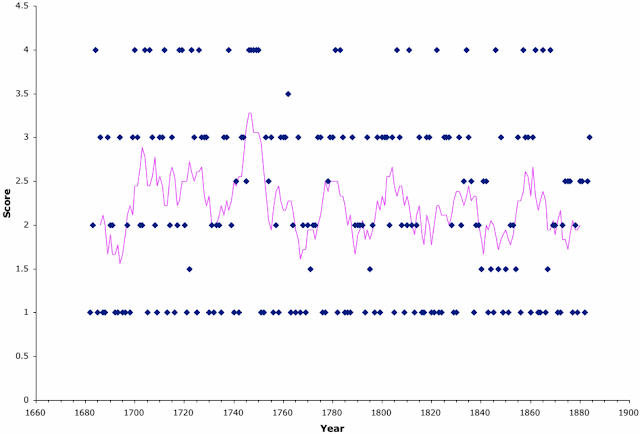
In the next graph I have shown the harvest-quality data as a time series, with the quality codes converted to the scores 1-4. Each data point represents a vintage, and the pink line is a running average (it shows the average value across groups of 9 consecutive years, thus smoothing out the long-term trends). [Technical note: the data are of ordinal type but not necessarily interval type, and so calculating an average may not actually be valid. I have simply assumed that it is appropriate, given the relatively close fit to the binomial probability distribution.]
Using the scale 1-4, the average vintage score is 2.2, whereas it would be 2.5 for random data, so that the average harvest across the 203 years was slightly below expectation (as also noted above for the frequency distribution). There is no general long-term trend in vintage quality across these two centuries, which cover the second half of the global cold period known as the Little Ice Age (1300-1850 CE).
There are, however, remarkably regular peaks in quality every 25-30 years (as shown by the peaks and valleys of the pink line). The cause of this is not immediately obvious, although it is presumably related to cyclical weather patterns. The first two of the quality peaks actually run together (ie. there is no intermediate dip in quality), so that the vintages were generally good from 1700-1730.
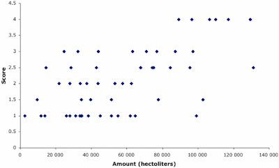
The second graph shows the relationship between vintage quality (vertically) and vintage quantity (horizontally), with each point representing a vintage from 1830-1884. There is a general positive association between quality and quantity (correlation r=0.59), so that, for example, small numbers of grapes are never associated with the best quality score. Mark Matthews, in Terroir and Other Myths of Winegrowing (University of California Press, 2016) points out that this is often true of wine making.
Interestingly, this vintage chart is not the only presentation of the Rheingau wine quality from this time period. Karl Storchmann (2005. English weather and Rhine wine quality: an ordered probit model. Journal of Wine Research 16:105-120) has transcribed a set of verbal descriptions of vintages into a set of quality scores. His data are for a single vineyard, Schloss Johannisberg (mentioned above), covering the period 1700-2000 CE. I have not yet obtained a copy of these data, to make a direct comparison with the data shown above.
Notes: The following is a transcription of the original Gothic script into modern German. I have translated the quality color codes using the 1-4 scores. For some of the years the score is shown as being a mixture of two different codes (eg. 1/2), as explained in the Remarks (Bemerkungen) below. The first part of the chart has only abbreviated comments about the harvest quantity (Menge = amount). The middle part of the chart also provides a score for the amount (x⁄x). The final part of the chart provides the estimated harvest quantity, in hectoliters. If you are interested, Google Translate does a reasonable job of translating the German text.
Bemerkungen.
Wenn allgemeine Angaben über die Menge bis zum Jahre 1829 in den benüßten Chroniken* nicht vorhanden waren, wurden dieselben weggelassen und folche nur für die Jahre eingefeßt, über welche entsprechende Mittheilungen sich vorsanden. Stimmten die diesbezüglichen Auszeichnungen nucht überein, so sind die sich widersprechenden Angaben einander gegenübergestellt.
Die Menge für die Jahre 1830 bis 1884 ist nach den officiellen Erhebungen für das Gebiet des vormaligen Herzogthumes Nassau in hektolitern angegeben und deren Berschiedenheit graphisch dargestellt. Bis 1868 wurden die Angaben benüßt, welche Bolizeirath Höhn in Weisbaden bereits in einer für die Wiener Weltausstellung 1873 zusammengestellten Tabelle ausgesührt hatte.
Die Güte ist entsprehend der Qualität der Rheingauer Weine im Allgemeinen durch die nachstehend ernähnten Farben ausgedrükt. Da die Darstellung den Charakter der Weine im Allgemeinen ausbrüken soll, so ist natürlich nicht ausgeschlossen, baß in speciellen Jällen d. h. engeren Bezirken in den betressenden Jahren auch bessere oder geringere Qualitäten erzielt wurden, als es den gewählten Farben entspricht.
Haben bis zum Jahre 1829 für denselben Jahrgang zwei Farben Berwendung gesunden, so stimmten die Angaben der Chroniken nicht überein, sondern wichen in der Weise von einander ab, wie die betressenden Farben veranschaulichen.
Die Güte für die Jahre 1830 bis 1884 wird wie oben durch Farben veranschaulicht und ist die Darstellung aus Grund der diesbezüglichen Mittheilungen eines der hervorragensten Rheingauer Weinkenner, dessen Ersahrungen bis zu dem zweiten Decenium dieses Jahrhunderts hinausreichen, ersolgt. Sind in besagtem Zeitraum für einen Jahrgang zwei Farben benußt, so bemegt sich die Güte innerhalb des hierdurch angedeuteten Werthes.
Die Qualität ist durch solgende Farben ausgedrüßt.
* Es wurden hierbei solgende Quellen benüßt:
1. Rheingauer Geschichts- und Wein-chronik. Von Dr. Rob. Haas. Weisbaden 1854.
2. Der Weinbau in Nassau. Von O. Sartorius. Weisbden 1871.
3. Der Weinbau der leßten hundert Jahre im Rheingau. Von T. B. Weinbau und Weinhandel 1885, S. 51.
4. Über das Schäßen der Weinernten. Von W. Rasch. Ebdenda S. 60.
Nevertheless, I have previously discussed long-term continuous records of vintage quality for several vineyard regions, including century-long recording for Bordeaux, in southern France (Two centuries of Bordeaux vintages — Tastet & Lawton) and Piemonte, in northern Italy (A century of Barolo vintages — Fontanafredda; More than a century of Barolo vintages — Marchesi di Barolo).
Intriguingly, the oldest known continuous vintage-quality record is for the Rheingau region in southern Germany, covering the years 1682-1884 CE, which thus includes scores for 203 consecutive vintages.
The Rheingau
The Rhine River generally flow north from the Alps to the North Sea. However, at one point it turns west, having encountered the southern part of the Taunus plateau. After 20 km or so it breaks northwards again, between the Taunus and Hunsrück plateaus, forming the best known part of the river, the Romantic Rhine so beloved of tourists, with the old castles on the tops of the river gorge, and even in the river itself.
The east-west part of the river is the Rheingau, with most of the vineyards on the gently sloping south-facing slopes next to the river itself.
As Stuart Pigott recently noted about the period covered by the vintage chart:
The Rheingau may be much older than the Medoc in Bordeaux, for example, but the most decisive period of its history came in the 18th century, beginning with the world’s first varietal plantings of the Riesling grape, the introduction of late harvesting, and the selective harvesting of bunches. All of this happened at the same property: Schloss Johannisberg, in 1720-21, 1775 and 1787, respectively. [Down the road, Schloss Vollrads is the oldest operating commercial winery in the world, with its first documented release of wine in 1211 CE.]Vintage chart
For a century following the breakthrough vintage of 1811, Rheingau Rieslings were the most sought-after and expensive wines in the world. By the 1850s, the Rheingau was on a roll. The majority of the region’s wines were dry, but those that wrote the headlines were sweet wines made from nobly rotten grapes. Then, at the end of the 19th century, it was overtaken by the Mosel.
The vintage chart in question appears as Table V of a book called Karte und Statistik des Weinbaues im Rheingau, compiled in 1885 by Heinrich Wilhelm Dahlen. This book is available online at the Landesbibliothekszentrum Rheinland-Pfalz.
The chart itself is entitled Uebersicht von Menge und Güte der Wein-Erträge in dem vormaligen Herzogthume Nassau in den Jahren 1682 bis 1884 (Overview of the quantity and quality of the wine-income in the former duchy of Nassau in the years 1682 to 1884). A direct link to the chart is available here.
The chart uses a color code to indicate the wine quality for each vintage, along with a written indication of the quantity of the harvest. The quantity is indicated by words in the first three columns of the chart, but there are actual volumes (in hectoliters) in the final column; the length of the colored bars in the final column also indicates the quantity. The 4-point quality color code is:
| Vorzüglich Gut Mittelmäßig Gering und schlecht |
excellent good mediocre (or fair) poor and bad |
red light green brown dark green |
In the rest of this post, I provide a transcription of this vintage chart, along with some analysis of the data. Thanks to the Hogshead blog (Buy 1684, avoid 1687: an historic German vintage chart) for drawing my attention to this extraordinary historical record.
Analysis
Here is a summary of the harvest-quality data for the 203 vintages:
| Excellent | 26 |
| Good/excellent | 1 |
| Good | 50 |
| Mediocre/good | 14 |
| Mediocre | 45 |
| Poor/mediocre | 9 |
| Poor | 63 |
Here are the same data presented as a frequency histogram of increasing quality. For random data his would follow what is known as a binomial probability distribution. It approximately does so, but for a perfect fit there are actually a few too many vintages of the "poor and bad" sort relative to the "mediocre" sort.
In the next graph I have shown the harvest-quality data as a time series, with the quality codes converted to the scores 1-4. Each data point represents a vintage, and the pink line is a running average (it shows the average value across groups of 9 consecutive years, thus smoothing out the long-term trends). [Technical note: the data are of ordinal type but not necessarily interval type, and so calculating an average may not actually be valid. I have simply assumed that it is appropriate, given the relatively close fit to the binomial probability distribution.]
Using the scale 1-4, the average vintage score is 2.2, whereas it would be 2.5 for random data, so that the average harvest across the 203 years was slightly below expectation (as also noted above for the frequency distribution). There is no general long-term trend in vintage quality across these two centuries, which cover the second half of the global cold period known as the Little Ice Age (1300-1850 CE).
There are, however, remarkably regular peaks in quality every 25-30 years (as shown by the peaks and valleys of the pink line). The cause of this is not immediately obvious, although it is presumably related to cyclical weather patterns. The first two of the quality peaks actually run together (ie. there is no intermediate dip in quality), so that the vintages were generally good from 1700-1730.
The second graph shows the relationship between vintage quality (vertically) and vintage quantity (horizontally), with each point representing a vintage from 1830-1884. There is a general positive association between quality and quantity (correlation r=0.59), so that, for example, small numbers of grapes are never associated with the best quality score. Mark Matthews, in Terroir and Other Myths of Winegrowing (University of California Press, 2016) points out that this is often true of wine making.
Interestingly, this vintage chart is not the only presentation of the Rheingau wine quality from this time period. Karl Storchmann (2005. English weather and Rhine wine quality: an ordered probit model. Journal of Wine Research 16:105-120) has transcribed a set of verbal descriptions of vintages into a set of quality scores. His data are for a single vineyard, Schloss Johannisberg (mentioned above), covering the period 1700-2000 CE. I have not yet obtained a copy of these data, to make a direct comparison with the data shown above.
Transcription
Notes: The following is a transcription of the original Gothic script into modern German. I have translated the quality color codes using the 1-4 scores. For some of the years the score is shown as being a mixture of two different codes (eg. 1/2), as explained in the Remarks (Bemerkungen) below. The first part of the chart has only abbreviated comments about the harvest quantity (Menge = amount). The middle part of the chart also provides a score for the amount (x⁄x). The final part of the chart provides the estimated harvest quantity, in hectoliters. If you are interested, Google Translate does a reasonable job of translating the German text.
Übersicht von Menge und Güte der Wein-Erträge in dem vormaligen Herzogthume Nassau in den Jahren 1682 bis 1884.
Bemerkungen.
Wenn allgemeine Angaben über die Menge bis zum Jahre 1829 in den benüßten Chroniken* nicht vorhanden waren, wurden dieselben weggelassen und folche nur für die Jahre eingefeßt, über welche entsprechende Mittheilungen sich vorsanden. Stimmten die diesbezüglichen Auszeichnungen nucht überein, so sind die sich widersprechenden Angaben einander gegenübergestellt.
Die Menge für die Jahre 1830 bis 1884 ist nach den officiellen Erhebungen für das Gebiet des vormaligen Herzogthumes Nassau in hektolitern angegeben und deren Berschiedenheit graphisch dargestellt. Bis 1868 wurden die Angaben benüßt, welche Bolizeirath Höhn in Weisbaden bereits in einer für die Wiener Weltausstellung 1873 zusammengestellten Tabelle ausgesührt hatte.
Die Güte ist entsprehend der Qualität der Rheingauer Weine im Allgemeinen durch die nachstehend ernähnten Farben ausgedrükt. Da die Darstellung den Charakter der Weine im Allgemeinen ausbrüken soll, so ist natürlich nicht ausgeschlossen, baß in speciellen Jällen d. h. engeren Bezirken in den betressenden Jahren auch bessere oder geringere Qualitäten erzielt wurden, als es den gewählten Farben entspricht.
Haben bis zum Jahre 1829 für denselben Jahrgang zwei Farben Berwendung gesunden, so stimmten die Angaben der Chroniken nicht überein, sondern wichen in der Weise von einander ab, wie die betressenden Farben veranschaulichen.
Die Güte für die Jahre 1830 bis 1884 wird wie oben durch Farben veranschaulicht und ist die Darstellung aus Grund der diesbezüglichen Mittheilungen eines der hervorragensten Rheingauer Weinkenner, dessen Ersahrungen bis zu dem zweiten Decenium dieses Jahrhunderts hinausreichen, ersolgt. Sind in besagtem Zeitraum für einen Jahrgang zwei Farben benußt, so bemegt sich die Güte innerhalb des hierdurch angedeuteten Werthes.
Die Qualität ist durch solgende Farben ausgedrüßt.
* Es wurden hierbei solgende Quellen benüßt:
1. Rheingauer Geschichts- und Wein-chronik. Von Dr. Rob. Haas. Weisbaden 1854.
2. Der Weinbau in Nassau. Von O. Sartorius. Weisbden 1871.
3. Der Weinbau der leßten hundert Jahre im Rheingau. Von T. B. Weinbau und Weinhandel 1885, S. 51.
4. Über das Schäßen der Weinernten. Von W. Rasch. Ebdenda S. 60.
| Jahr | Score | Menge |
| 1682 | 1 | wenig |
| 1683 | 2 | wenig |
| 1684 | 4 | voller herbst |
| 1685 | 1 | viel |
| 1686 | 3 | |
| 1687 | 1 | viel |
| 1688 | 1 | viel |
| 1689 | 3 | |
| 1690 | 2 | |
| 1691 | 2 | sehr wenig |
| 1692 | 1 | sehr wenig |
| 1693 | 1 | wenig |
| 1694 | 3 | |
| 1695 | 1 | wenig |
| 1696 | 1 | |
| 1697 | 2 | |
| 1698 | 1 | wenig |
| 1699 | 3 | viel |
| 1700 | 4 | |
| 1701 | 3 | |
| 1702 | 2 | |
| 1703 | 2 | |
| 1704 | 4 | |
| 1705 | 1 | wenig |
| 1706 | 4 | voller herbst |
| 1707 | 3 | |
| 1708 | 2 | |
| 1709 | 1 | starker winterfrost |
| 1710 | 3 | |
| 1711 | 3 | |
| 1712 | 4 | sehr viel |
| 1713 | 1 | |
| 1714 | 2 | |
| 1715 | 3 | |
| 1716 | 1 | |
| 1717 | 2 | |
| 1718 | 4 | |
| 1719 | 4 | |
| 1720 | 2 | |
| 1721 | 1 | |
| 1722 | 1/2 | |
| 1723 | 4 | viel |
| 1724 | 3 | |
| 1725 | 1 | sehr wenig |
| 1726 | 4 | voller herbst |
| 1727 | 3 | sehr viel |
| 1728 | 3 | |
| 1729 | 3 | viel |
| 1730 | 1 | |
| 1731 | 2 | |
| 1732 | 1 | |
| 1733 | 2 | |
| 1734 | 2 | |
| 1735 | 1 | |
| 1736 | 3 | |
| 1737 | 3 | |
| 1738 | 4 | |
| 1739 | 2 | viel |
| 1740 | 1 | frühsr. viels. nicht gel |
| 1741 | 2/3 | wenig |
| 1742 | 1 | wenig |
| 1743 | 3 | |
| 1744 | 3 | |
| 1745 | 2/3 | wenig |
| 1746 | 4 | sehr wenig |
| 1747 | 4 | |
| 1748 | 4 | |
| 1749 | 4 | wenig |
| 1750 | 4 | viel |
| 1751 | 1 | wenig |
| 1752 | 1 | viel |
| 1753 | 3 | gehr viel |
| 1754 | 2/3 | |
| 1755 | 3 | wenig |
| 1756 | 1 | mittelertrag |
| 1757 | 2 | halber herbst |
| 1758 | 1 | viel |
| 1759 | 3 | viel |
| 1760 | 3 | viel |
| 1761 | 3 | viel |
| 1762 | 3/4 | gehr viel |
| 1763 | 1 | vielfach nicht gelesen |
| 1764 | 2 | wenig |
| 1765 | 1 | sehr wenig |
| 1766 | 3 | viel |
| 1767 | 1 | sehr wenig |
| 1768 | 2 | wenig |
| 1769 | 1 | viel |
| 1770 | 2 | wenig |
| 1771 | 1/2 | viel |
| 1772 | 2 | viel |
| 1773 | 2 | |
| 1774 | 3 | viel |
| 1775 | 3 | viel |
| 1776 | 1 | wenig |
| 1777 | 1 | mittelertrag |
| 1778 | 2/3 | wenig |
| 1779 | 3 | viel |
| 1780 | 3 | viel |
| 1781 | 4 | sehr viel |
| 1782 | 1 | biemlich viel, fruhfr. |
| 1783 | 4 | hauptjahr |
| 1784 | 3 | sehr wenig (1⁄8) |
| 1785 | 1 | biemlich viel (1⁄2) |
| 1786 | 1 | wenig (1⁄4) |
| 1787 | 1 | viel (1⁄2) |
| 1788 | 3 | viel (0) |
| 1789 | 2 | wenig, spätfrost (1⁄8) |
| 1790 | 2 | wenig (1⁄8) |
| 1791 | 1/3 | frühfrost, 1⁄2 herbst |
| 1792 | 1/3 | feblj. & spätfr. (1⁄8) |
| 1793 | 1 | sehr wenig (1⁄8) |
| 1794 | 3 | mittelertrag (4⁄8) |
| 1795 | 1/2 | wenig (1⁄8) |
| 1796 | 1/3 | wenig (1⁄8) |
| 1797 | 1 | wenig (1⁄8) |
| 1798 | 3 | viel (1⁄2) |
| 1799 | 1 | sr. hagelbeichädg. (1⁄8) |
| 1800 | 3 | sehr wenig (1⁄3) |
| 1801 | 3 | wenig bis viel (1⁄2) |
| 1802 | 3 | sehr wenig bis ziemt. viel (1⁄8) |
| 1803 | 2 | (2⁄8) |
| 1804 | 3 | sehr viel (1⁄1) |
| 1805 | 1 | sehr wenig (0), frühfr. |
| 1806 | 4 | biemlich viel (1⁄3) |
| 1807 | 3 | biemlich viel (1⁄3) |
| 1808 | 2 | viel (1⁄1) |
| 1809 | 1 | wenig (1⁄8) |
| 1810 | 2 | wenig (1⁄2) |
| 1811 | 4 | sehr viel (1⁄3) |
| 1812 | 2 | nicht viel (2⁄3) |
| 1813 | 1 | sehr wenig (1⁄8) |
| 1814 | 2 | sehr wenig (1⁄8) |
| 1815 | 3 | wenig (1⁄3) |
| 1816 | 1 | vielfach nicht gel. (0) |
| 1817 | 1 | wenig (1⁄8) |
| 1818 | 3 | mittelertrag (1⁄1) |
| 1819 | 3 | viel bis sehr viel (1⁄1) |
| 1820 | 1 | rein (1⁄2), herbst (1/3) |
| 1821 | 1 | unbedeutend (1⁄3) |
| 1822 | 4 | voller herbst (1⁄3) |
| 1823 | 1 | halber herbst (1⁄3) |
| 1824 | 1 | wenig (1⁄4) |
| 1825 | 3 | viel (1⁄2) |
| 1826 | 3 | voller herbst (1⁄1) |
| 1827 | 3 | sehr wenig (1⁄4) |
| 1828 | 2 | voller herbst (1⁄1) |
| 1829 | 1 | sehr wenig (1⁄6), herbst (1⁄3) |
| 1830 | 1 | 2,700 |
| 1831 | 3 | 32,412 |
| 1832 | 1/3 | 33,840 |
| 1833 | 2/3 | 95,472 |
| 1834 | 4 | 106,368 |
| 1835 | 3 | 87,120 |
| 1836 | 2/3 | 42,768 |
| 1837 | 1 | 31,236 |
| 1838 | 2 | 21,768 |
| 1839 | 1/3 | 43,644 |
| 1840 | 1/2 | 39,660 |
| 1841 | 2/3 | 28,572 |
| 1842 | 2/3 | 67,728 |
| 1843 | 1 | 34,486 |
| 1844 | 1/2 | 34,392 |
| 1845 | 1 | 34,548 |
| 1846 | 4 | 117,000 |
| 1847 | 1/2 | 102,804 |
| 1848 | 3 | 63,264 |
| 1849 | 1 | 44,916 |
| 1850 | 1/2 | 51,216 |
| 1851 | 1 | 51,300 |
| 1852 | 2 | 53,232 |
| 1853 | 2 | 53,256 |
| 1854 | 1/2 | 9,516 |
| 1855 | 3 | 43,968 |
| 1856 | 1 | 27,888 |
| 1857 | 4 | 109,968 |
| 1858 | 3 | 97,104 |
| 1859 | 3 | 71,040 |
| 1860 | 1 | 64,800 |
| 1861 | 3 | 24,624 |
| 1862 | 4 | 96,480 |
| 1863 | 1 | 54,960 |
| 1864 | 1 | 33,612 |
| 1865 | 4 | 89,220 |
| 1866 | 1 | 99,000 |
| 1867 | 1/2 | 77,676 |
| 1868 | 4 | 129,485 |
| 1869 | 2 | 57,552 |
| 1870 | 2 | 62,616 |
| 1871 | 1 | 25,874 |
| 1872 | 1 | 11,612 |
| 1873 | 2 | 27,839 |
| 1874 | 2/3 | 84,284 |
| 1875 | 2/3 | 131,088 |
| 1876 | 2/3 | 75,070 |
| 1877 | 1 | 61,827 |
| 1878 | 2 | 37,416 |
| 1879 | 1 | 13,928 |
| 1880 | 2/3 | 14,452 |
| 1881 | 2/3 | 67,691 |
| 1882 | 1 | 38,392 |
| 1883 | 2/3 | 74,220 |
| 1884 | 3 | 76,820 |
Monday, December 12, 2016
Summarizing multi-dimensional wine data as graphs, Part 2: networks
In a previous blog post I introduced ordination analyses, as a mathematical technique for summarizing multivariate data — Summarizing multi-dimensional wine data as graphs, Part 1: ordinations.
Multivariate data have measurements of multiple characteristics for each of a set of "objects". The objective of the analysis is to mathematically summarize the multiple dimensions down to something manageable, which can then bw displayed as a picture. This picture will give is an overview of the patterns in the data, rather than displaying the details of each characteristic.
Ordination analyses put the objects in some order along one or two dimensions (hence the name). In the resulting graph the points represent the objects, and the relationships of the points in the graph represent their similarity, based on the summary of the original data. Points close together are more similar than are points further apart.
In this post, I introduce the use of networks as an alternative way to summarize multivariate data. In particular, the networks that I introduce are called phylogenetic networks. I have a special interest in these networks, since it is what I have worked on in my professional life (some of this work is discussed at the end of this post).
Phylogenetic networks
Phylogenetic networks differ from what are called interaction networks, which many people are familiar with — a food web is a classic example of an interaction network, where the objects in the network are different organisms, which are connected by lines indicating who eats whom. This type of network uses lines to connect objects based on relationships that are directly observed.
A phylogenetic network, on the other hand, connects the objects with multiple lines showing a summary of their similarities. That is, the network is a bit like an ordination, which uses space to display the relationships among the objects, but the points are now connected by lines. Objects that are close together in the network are more similar to each other than are points further apart, but the relationships are traced only along the lines, not directly from point to point. That is, the lengths of the connecting lines contain information about the data summary, and the ways in which they connect also contain information.
The advantage here is that the lines will often indicate clusters of points in the multidimensional data that cannot be displayed in a 2-dimensional ordination. So, the network can be more informative.
An example
I have compiled some multidimensional data relating to the quality scores of a collection of Australian wines, as provided by a number of raters — Jeremy Oliver, James Halliday, the Wine Front, and Cellar Tracker. The first two raters are individual people, the third one is a group of three people (Mike Bennie, Campbell Mattinson, Gary Walsh), any one of whom may have rated the wine, and the fourth one is a community site that provides ratings averaged across many people.
In this example, the 4 wine-raters are the objects, and their multiple characteristics are the quality scores given to the wines (there are 114 wines and thus 114 dimensions to the data). We wish to see how similar are the raters, by summarizing the multidimensional data down to a single picture.
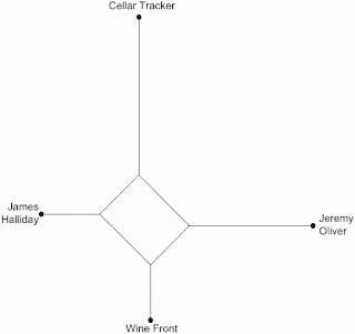
This can be done using a NeighborNet network, as shown in the first figure. Note that the four raters are connected by a set of lines, and it is these connections that summarize the data.
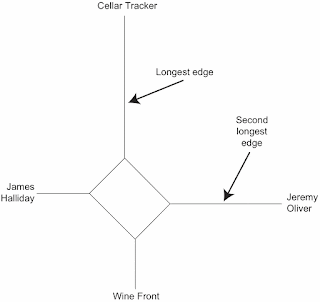
The lengths of the lines are important. The longest line (technically called an edge) separates the Cellar Tracker ratings from the rest of the network, indicating that the Cellar Tracker ratings are often quite different to those of the other three raters. Indeed, the original data shows that these scores are usually much smaller than are the other three scores, for any given wine.
A similar thing applies to the scores from Jeremy Oliver, which are separated by the second-longest line — his scores are also often quite different to the others. Indeed, he has acknowledged this in his writings, pointing that as a wine commentator he is often more critical than are other (unnamed) commentators.
In the middle of the network there is a box-like structure connecting the four raters together in various ways. This box is not square, which means that some of the raters are more similar to each other than are others, as represented by the distances connecting them along the edges.
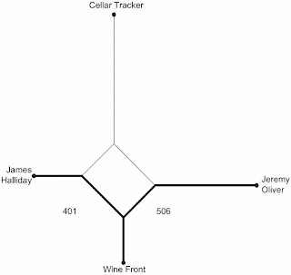
For example, the shortest distance along the lines from James Halliday to the Wine Front (401 units) is less than the distance from Jeremy Oliver to the Wine Front (506 units). This means that the former pair are more similar than are the latter pair.
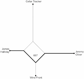
Furthermore, the distance along the edges from Jeremy Oliver to James Halliday is much longer (667 units), indicating that this pair of people produce the least similar scores of the three Australian raters. All of these relationships can be seen at a glance, which is what makes the network useful as a summary of the original data.
This is a relatively simple example, because there are only four objects. Clearly, a network will get more and more complex as we add more objects to the analysis. There are examples of this phenomenon in the links below.
Some other examples
Based on this explanation of phylogenetic networks, you might like to look at a few of the interesting examples from my professional blog, showing you the range of possible uses of networks. By "interesting" I mean that the subject matter of the blog post is interesting, not necessarily the networks themselves! The complete list of my network analyses is in this blog page: Analyses.
Simple datasets:
The use of phylogenetic networks was formally introduced in this research publication, which also contains a range of example analyses:
Multivariate data have measurements of multiple characteristics for each of a set of "objects". The objective of the analysis is to mathematically summarize the multiple dimensions down to something manageable, which can then bw displayed as a picture. This picture will give is an overview of the patterns in the data, rather than displaying the details of each characteristic.
Ordination analyses put the objects in some order along one or two dimensions (hence the name). In the resulting graph the points represent the objects, and the relationships of the points in the graph represent their similarity, based on the summary of the original data. Points close together are more similar than are points further apart.
In this post, I introduce the use of networks as an alternative way to summarize multivariate data. In particular, the networks that I introduce are called phylogenetic networks. I have a special interest in these networks, since it is what I have worked on in my professional life (some of this work is discussed at the end of this post).
Phylogenetic networks
Phylogenetic networks differ from what are called interaction networks, which many people are familiar with — a food web is a classic example of an interaction network, where the objects in the network are different organisms, which are connected by lines indicating who eats whom. This type of network uses lines to connect objects based on relationships that are directly observed.
A phylogenetic network, on the other hand, connects the objects with multiple lines showing a summary of their similarities. That is, the network is a bit like an ordination, which uses space to display the relationships among the objects, but the points are now connected by lines. Objects that are close together in the network are more similar to each other than are points further apart, but the relationships are traced only along the lines, not directly from point to point. That is, the lengths of the connecting lines contain information about the data summary, and the ways in which they connect also contain information.
The advantage here is that the lines will often indicate clusters of points in the multidimensional data that cannot be displayed in a 2-dimensional ordination. So, the network can be more informative.
An example
I have compiled some multidimensional data relating to the quality scores of a collection of Australian wines, as provided by a number of raters — Jeremy Oliver, James Halliday, the Wine Front, and Cellar Tracker. The first two raters are individual people, the third one is a group of three people (Mike Bennie, Campbell Mattinson, Gary Walsh), any one of whom may have rated the wine, and the fourth one is a community site that provides ratings averaged across many people.
In this example, the 4 wine-raters are the objects, and their multiple characteristics are the quality scores given to the wines (there are 114 wines and thus 114 dimensions to the data). We wish to see how similar are the raters, by summarizing the multidimensional data down to a single picture.
This can be done using a NeighborNet network, as shown in the first figure. Note that the four raters are connected by a set of lines, and it is these connections that summarize the data.
The lengths of the lines are important. The longest line (technically called an edge) separates the Cellar Tracker ratings from the rest of the network, indicating that the Cellar Tracker ratings are often quite different to those of the other three raters. Indeed, the original data shows that these scores are usually much smaller than are the other three scores, for any given wine.
A similar thing applies to the scores from Jeremy Oliver, which are separated by the second-longest line — his scores are also often quite different to the others. Indeed, he has acknowledged this in his writings, pointing that as a wine commentator he is often more critical than are other (unnamed) commentators.
In the middle of the network there is a box-like structure connecting the four raters together in various ways. This box is not square, which means that some of the raters are more similar to each other than are others, as represented by the distances connecting them along the edges.
For example, the shortest distance along the lines from James Halliday to the Wine Front (401 units) is less than the distance from Jeremy Oliver to the Wine Front (506 units). This means that the former pair are more similar than are the latter pair.
Furthermore, the distance along the edges from Jeremy Oliver to James Halliday is much longer (667 units), indicating that this pair of people produce the least similar scores of the three Australian raters. All of these relationships can be seen at a glance, which is what makes the network useful as a summary of the original data.
This is a relatively simple example, because there are only four objects. Clearly, a network will get more and more complex as we add more objects to the analysis. There are examples of this phenomenon in the links below.
Some other examples
Based on this explanation of phylogenetic networks, you might like to look at a few of the interesting examples from my professional blog, showing you the range of possible uses of networks. By "interesting" I mean that the subject matter of the blog post is interesting, not necessarily the networks themselves! The complete list of my network analyses is in this blog page: Analyses.
Simple datasets:
- A network analysis of Simon and Garfunkel
- A network analysis of pizza styles
- What is in Traditional Chinese Medicines — a network analysis
- The acoustics of the Sydney Opera House
- Network analysis of McDonald's fast-food
- Spinach and the iron fallacy
- Network analysis of scotch whiskies
- Eurovision Song Contest 2006: a network analysis
- A network analysis of airplane disasters
The use of phylogenetic networks was formally introduced in this research publication, which also contains a range of example analyses:
- Morrison D.A. (2014) Phylogenetic networks — a new form of multivariate data summary for data mining and exploratory data analysis. Wiley Interdisciplinary Reviews: Data Mining and Knowledge Discovery 4: 296-312.
Monday, December 5, 2016
Are there biases in community wine-quality scores?
In an earlier blog post I considered Biases in wine quality scores. This issue had been previously pointed out by Alex Hunt (What's in a number? Part the second), who presented graphs of the data from various well-known wine commentators showing that the scores they give wines have certain biases. In particular, some scores are consistently over-represented, such as 90 compared to 89 (using the 100-point scale) and 100 compared to 99. In my post, I performed a detailed analysis of a particular dataset (from the Wine Spectator), showing how we could mathematically estimate the extent of this bias.
This point immediately raises the question as to whether these biases also occur in community-based wine scores, or whether they are restricted to scores that are compiled from individual people. Community scores are compiled from the users of sites such as Cellar Tracker, where they simply pool all of their individual scores for each wine. It is possible that, even if each individual scorer shows biases towards certain scores, these biases might average out across all of the scorers, and thus be undetectable. Alternatively, the biases might be widespread, and thus still be evident even in the pooled data.
To find out, I downloaded the publicly available scores from Cellar Tracker for eight wines (for my data, only 55-75% of the scores were available as community scores, with the rest not being shared by the users). These eight wines included red wines from several different regions, a sweet white, a still white, a sparkling wine, and a fortified wine. In each case I searched for a wine with at least 300 community scores; but I did not succeed for the still white wine, and in that case the best I could find had only 189 scores.
Below, I have plotted the frequency distribution of the Cellar Tracker scores for each of the eight wines. As in my previous post on this topic, the height of each vertical bar in a graph represents the proportion of wines receiving the score indicated on the horizontal axis.
As you can see, these graphs do show distinct biases, although some of the graphs are much less biased than are others.
The principal bias, when it occurs, is most commonly an over-representation of scores in units of five: 70, 75, 80, 85, 90, and 95. In particular, the first five graphs show this pattern to one extent or another. So, it seems that a lot of the users are actually scoring their wines on a 20-point scale, and then simply multiplying them by 5 to get to the 100-point scale required by Cellar Tracker.
The final three graphs show an over-representation of the score 88, compared to scores of 87 and 89 (and the first graph also has this pattern). This seems to be a manifestation of the same bias shown by the professional commentators, in which a score of 90 occurs more commonly than 89. That is, a score of 88 is used to indicate a wine that is well-liked, while a score of 90 represents a wine that is great, thus leaving a score of 89 in limbo.
Finally, the last graph shows an under-representation of the score 96, compared to scores of 95 and 97. There seems to be no obvious reason for this.
1:
2:
3:
4:
5:
6:
7:
8:
Subscribe to:
Posts (Atom)
