Monday, January 30, 2017

Why does anyone bother with Bordeaux en primeur?

The original idea of buying wine en primeur (also called wine futures, or in-bond offers) was quite simple. The producer gets some money early, before they release the wine, and the buyer gets a good price, lower than the final release price. En primeur sales exist in a number of European wine regions, including Bordeaux, Burgundy, Rhône, Douro (Port), Languedoc-Roussillon, Barolo / Barbaresco, and Rhine / Mosel.

To quote Langton's Fine Wines:
En Primeur is the absolute best way of securing parcels of some of the world’s most sought after wines before they are bottled and officially released to market. Moreover, En Primeur pricing is considerably cheaper than the release price.
This idea is illustrated in this graph from Wine-Searcher, which shows a rapid increase in price for some of the luxury wines from vintage 2000 in Bordeaux, during the first few years after the wine was released.


Unfortunately, for the past decade this happy situation has not happened for Bordeaux wines. This fact has been pointed out by a number of people, and yet the en primeur sales continue.

For Bordeaux, the new wine is offered in the May following the vintage (which is August-October), and shipped 20-28 months later, having been bottled at 12-18 months. So, the buyers' decision is made 8 months after the harvest, 6 months before bottling, and 18 months before receiving the wine.

This behavior seems to require a good incentive for the buyer, which these days is hard to see. As explained by The Spectator magazine:
Back in the 1970s, it was an accepted wine-trade belief that if you bought wine en primeur you would be able to sell half in two or three years at double your money, meaning you could drink for free ... [However,] the 2005 Bordeaux vintage was the last major one that gave decent returns relatively quickly ... Since 2008 punters have lost money on every single vintage except 2012, where the modest 9 per cent gain has been wiped out by the 10 per cent sales commission ... It is a mystery why anybody would sink their money into a system that has delivered such poor value.
The Liv-Ex wine exchange has studied this situation, based on their own trading data for fine wines. This second graph (from 2014) illustrates the point at hand. The solid bars show the sale price at release versus the price 2 years later. As you can see, up to and including the 2005 vintage it was common to make a substantial profit from buying en primeur, but that has been true only once since then. In fact, most people will have made a considerable loss.


This next graph illustrates the effect over time. The solid bars show the accumulated profit (to 2013) of buying the Bordeaux wines en primeur. Even the 2005 vintage has not returned a large profit, while most of the other recent ones have returned a loss. The relative cost of the different vintages is indicated by the blue line, with 1995 set to a value of 100. So, the 2009 and 2010 vintages cost a fortune (relative to the 1995 vintage), and they led to substantial losses. This is not good business.


This has led to a financially ridiculous situation, as noted by the Shanghai Daily:
By the late 2000s the prices that the Chateau were releasing were so high that two factors presented themselves. Firstly, it was often possible to buy already bottled wine from just as good, or even superior, vintages in the market, and these wines were guaranteed, immediately available, and significantly more ready to drink. 2005 is a monumentally superb vintage. The scores were high, and the prices higher. Nevertheless, ... by the time the prices for 2009 and 2010 — two further exquisite vintages — were released, it was possible to buy the 2005 wines in the market for less than the En Primeur release prices of 2009 and 2010.
This pattern is repeated for every one of the luxury Bordeaux wines, each of which costs a small fortune to buy. This series of graphs from 2016 show that profits have all but disappeared since the 2008 vintage, and substantial losses are frequent. Someone has to be pretty desperate to buy any of these wines en primeur.


If you want to see the time course of events, this next graph shows the price of the 2010 Château Lafite-Rothschild through time. The time to buy this wine was in 2015, not en primeur.


To put it as mildly as Tim Atkin:
En Primeur has become a system that consumers have lost a bit of love for because they got stung with the 2009s and 2010s ... And if the wine has decreased in value, people are right to ask themselves if they’re being ripped off.
Not unexpectedly, the last time I bought Bordeaux wine en primeur was for the 2005 vintage. As Lisa Perrotti-Brown has recently noted: "I like to think that I have the good sense to leave a party while I’m still having a good time."

PS. I do realize that without the yearly Bordeaux en primeur campaign there are many wine writers who would have very little to write about.
Monday, January 23, 2017

Long-term trends in Google wine-related searches

As I have noted before (The rise and fall of wine blogs, and other things), Google Trends aggregates the number of web searches that have been performed for any given search term (or terms); and it can display the results as a time graph, for any given geographical region. Here, I will use graphs that compare world-wide trends in the English-speaking part of the world (ie. where the web searches use English words) versus those within the USA. The Trends searches are somewhat restrictive, but they may show us something, anyway, about the period 2004-2016 (inclusive).

The Trends graphs show changes in the relative proportion of searches for the given term (vertically) through time (horizontally). The vertical axis is scaled so that 100 is simply the time with the most popularity as a fraction of the total number of searches (ie. the scale shows the proportion of searches, with the maximum always shown as 100, no matter how many searches there were).

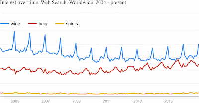
Google searches for "Wine", "Beer", "Spirits" from 2004-2016

My first consideration is for the word "Wine" versus "Beer" and "Spirits" as a search term. As you can see (above), world-wide searches for "Wine" slowly declined until 2010, while searches for "Beer" have slowly and consistently increased since then. We are getting close to the time when beer will be more popular than wine. "Spirits" lags a long way behind, with little change through time.

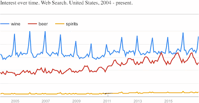
The trend for "Beer" is also increasing strongly within the USA (next graph), but there has been no associated decline in searches for "Wine". Indeed, "Wine" seems to have increased somewhat during 2011, and then remained steady thereafter.

Google searches for "Wine", "Beer", "Spirits" in the USA from 2004-2016

These two graphs also make it clear that there is an annual cycle in searches for "Wine" and "Beer". "Beer" peaks during the (northern hemisphere) summer months, while "Wine" has a sharp peak at the end of the year, during the second half of December. This pattern appears in both graphs but is more pronounced in the USA. This appearance in both graphs presumably reflects the fact that the USA dominates web searches in the English language.

The boost in interest in wine before the Christmas / New Year period may not reflect people with a strong interest in wine. Such people are unlikely to suddenly be looking for wine just before Christmas. The people who are doing these searches are probably people following the US tradition of having wine, but not beer, with their Christmas dinners, or they are giving the wine as a gift to a wine-loving friend or family member.

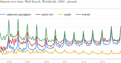
Google searches for red grapes from 2004-2016

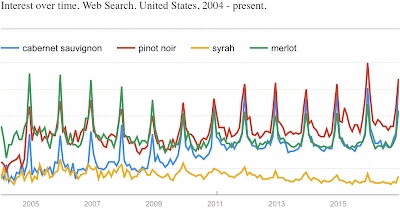
Moving on, we could look at the various types of wine, to see which wines are involved in the end-of-year boom. The next pair of graphs (above and below) covers a few of the red-wine grapes. As before, the two graphs are rather similar. However, the decrease in searches for "Merlot" is less pronounced in the USA, and the increased interest in "Pinot noir" is more pronounced. All four grape types are involved in the Christmas boom, to one extent or another.

Google searches for red grapes in the USA from 2004-2016

The sudden increase in searches for "Pinot noir" at the end of 2004 is, of course, associated with the film Sideways, thus illustrating the powerful effect of Hollywood on American society. The steady increase in web searches involving "Cabernet sauvignon", between 2008 and 2012, is more interesting, as its cause is not immediately obvious (at least to me).

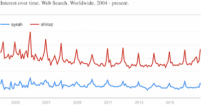
Google searches for "Shiraz" from 2004-2016

It is also worth noting that web searches for the Australian term "Shiraz" greatly out-number those for the alternative name for the grape, "Syrah", as shown in the above graph. This presumably indicates that wines named after this grape are far more commonly produced in Australia than elsewhere, and so the Australian name predominates — the Rhône region, of course, does not use the grape name on its wine labels.

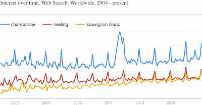
Google searches for red grapes from 2004-2016

The final pair of graphs (above and below) cover a few of the white-wine grapes. All three grape types show a steady increase in searches through time; so, the Anything But Chardonnay movement is no longer having much of an effect. The end-of-year bursts are also present here, at least in the second half of the time period.

Google searches for white grapes in the USA from 2004-2016

While "Chardonnay" searches dominate, it is clear that "Riesling" is no longer more popular than "Sauvignon blanc". The big boom in "Chardonnay" searches that covers most of 2011 is also a bit mysterious. A more detailed look at part of the "Chardonnay" searches (next graph) shows that the boom starts suddenly at the beginning of June 2011, peaks at the beginning of September, and slowly fades for the rest of the year.

Google searches for "Chardonnay" from 2004-2016

This graph also shows that the end-of-year peaks are actually a double peak — a small peak in the penultimate week of November (for Thanksgiving) and a bigger peak during the last two weeks of December (for Christmas / New Year). This is true for all of the grape types shown above, although it is not obvious in the rest of the graphs because of the coarse scale (monthly aggregation of data).

Monday, January 16, 2017

What's all this fuss about red versus white wine quality scores?

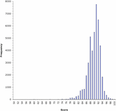
A few months ago, Suneal Chaudhary and Jeff Siegel released a report entitled Expert Scores and Red Wine Bias: a Visual Exploration of a Large Dataset. This was first announced on Siegel's Wine Curmudgeon site, and subsequently received a fair amount of internet comment. Chaudhary and Siegel's bottom line is that "Red wines, in our large data set, are more frequently scored higher than whites", when referring to wine-quality scores published by professional commentators.

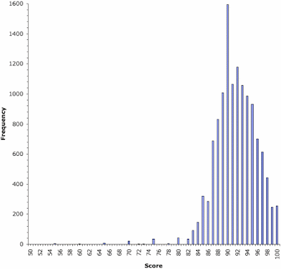
Chaudhary and Siegel's frequency histogram of their data

However, little of the web comment has been related to the actual report. As a scientist, I think that the work done is as least as interesting as the conclusions reached; and that is what I will comment on here. Indeed, I will not disagree with the conclusions, but I will disagree with some of the work.

Let's start by addressing the initial research question: "Do experts rate red wines more highly than white wines, regardless of price, vintage, and region?" A problem here is that we already know the answer to this question. As pointed out by the indefatigable Bob Henry, Robert M. Parker Jr. was interviewed in 1989 for the Wine Times magazine (later renamed the Wine Enthusiast), and described his now infamous 50-point wine-rating system:
Parker: It’s a fairly methodical system. The wine gets up to 5 points on color, up to 15 on bouquet and aroma, and up to 20 points on flavor, harmony and length. And that gets you 40 points right there. And then the [balance of] 10 points are ... simply awarded to wines that have the ability to improve in the bottle.
Times: Do you have a bias toward red wines? Why aren’t white wines getting as many scores in the upper 90s? Is it you or is it the wine?
Parker: Because of that 10-point cushion. Points are assigned to the overall quality but also to the potential period of time that wine can provide pleasure. And white Burgundies today have a lifespan of, at most, a decade with rare exceptions. Most top red wines can last 15 years and most top Bordeaux can last 20, 25 years. It’s a sign of the system that a great 1985 Morgon [cru Beaujolais] is not going to get 100 points because it’s not fair to the reader to equate a Beaujolais with a 1982 Mouton-Rothschild. You only have three or four years to drink the Beaujolais.
Fred Swan provides a detailed elaboration of this point, noting that it is a general feature of many scoring systems.

So, Chaudhary and Siegel's published work is an unfortunate example of what philosophers call "confirming the consequent" — demonstrating what we already know to be true (see Wikipedia). We don't need a data analysis of quality scores for 61,809 wines — we can take Parker's word for it. Many red wines age longer than most whites, and so there will be a definite measurable bias in scores, which will apply irrespective of price, vintage, and region. Chaudhary and Siegel have simply demonstrated that the critics are being as good as their word.

This makes it clear what question we should actually be asking: "Do wines that are expected to live longer get higher ratings by experts than do other wines, irrespective of wine type?" This is a somewhat different question to the above, because it asks whether long-lived red wines get better scores than shorter-lived red wines, and the same for white wines. Chaudhary and Siegel sub-divided their dataset in several different ways, but they did not sub-divide it based on longevity, and so they do not answer this question. However, I presume that they could do so, with a bit more data analysis.

Answering the question is straightforward in principle, although it may require a bit of work, and possibly some argument about the longevity of each wine type, because we will need to sub-divide the data by wine type and region. Many wine-making regions have both long-lived wines and drink-now wines, of both white and red types.

There are certainly many long-lived white wines, especially among the sweet wines (as also suggested by John Joseph), such as trockenbeerenauslese (especially), beerenauslese, auslese, eiswein / icewine, and even spätlese wines, plus Sauternes / Barsac, sélection de grains nobles, vendange tardive and Tokaji. We should also include chenin blanc wines from the Loire valley, and Hermitage wines from the Rhône. And that is just western Europe.

More to the point, there's an incredible amount of variation in longevity amongst red wines. At one end we have the fine wines of western Europe, such as Bordeaux, Barolo / Barbaresco, Brunello di Montalcino, Rioja, Ribera del Duero, Priorato, Hermitage, Chateauneuf-du-Pape, Cote Rôtie, and so on. And there are plenty from elsewhere in the world, as well, all of which should get high quality scores, according to Parker. At the other extreme, we have classics like non-cru Beaujolais (mentioned above), and those from Blaye and Tavel, as well as the dolcetto wines from Piemonte, all of which should score much lower. And in between we have more wines than you could care to name, which should get intermediate scores, on average.

To illustrate what I mean, here is an analysis of a dataset I happen to have at hand. It comes from Paulo Cortez, António Cerdeira, Fernando Almeida, Telmo Matos and José Reis (2009. Modeling wine preferences by data mining from physicochemical properties. Decision Support Systems 47: 547-533), and pertains to 4,898 whites and 1,599 reds from the Minho region of north-western Portugal. These vinho verde wines are not usually considered to be long-lived, and so they should be directly comparable under our experimental question (same region, same longevity, different colors). According to the authors, the wines were quality scored as follows:
Each sample was evaluated by a minimum of three sensory assessors (using blind tastes), [who] graded the wine on a scale that ranges from 0 (very bad) to 10 (excellent). The final sensory score is given by the median of these evaluations.

The resulting frequency histograms do not show any bias in score between reds and whites, exactly as we would expect — if anything, the whites do slightly better than the reds. [Note the log scale on the vertical axis.] So, what we need to do now is the same sort of thing, with all the rest of the wines in the Chaudhary and Siegel dataset.

Moving on to another issue, Chaudhary and Siegel consider several types of potential bias in their data. For example, their data are based on published scores, and the wine media are notorious for not bothering to publish low quality ratings. This creates what scientists call "publication bias", which means that the reds will have more scores published than will the whites, because their scores are often higher. The size of the dataset cannot help deal with this, as Chaudhary and Siegel claim, because dataset size deals only with stochastic (random) variation, not variation due to bias. This is a classic failing of many datasets in science, as it also is here.

This means that the quality scores might not actually represent what people drink, and therefore what is in the wine shops. For example, in the dataset of Chaudhary and Siegel 24% of the scores are for white wines and 76% are for reds, a ratio of 3:1 in favor of the reds. A quick search of the 9,411 wines in my local liquor chain, Systembolaget (reputed to be the third biggest alcohol chain in the world), reveals that they stock 37% white wines and 63% reds, a ratio of less than 2:1 for the reds. So, the Chaudhary and Siegel dataset probably cannot claim to be representative of the wine industry as a whole, only that part where scores actually get published. This is a pity.

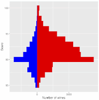
Finally, it is worth pointing out the massive bias that exists in the wine scores, as shown in the graph at the top of this post. For both white and red wines, a score of 90 points is massively over-represented compared to a score of 89 points. This is an embarrassment for the profession of wine commentary, as it gives the lie to any pretense that wine quality scores are objective. This is discussed in more detail in my post on Biases in wine quality scores.

If you are interested, Fred Swan also has a much longer list of queries about Chaudhary and Siegel's report.

Monday, January 9, 2017

Are there biases in wine quality scores from semi-professionals?

I have previously discussed biases in the quality ratings of professional commentators, as well as in the pooled scores from the amateurs at Cellar Tracker. These biases involve the over-representation of certain scores compared to adjacent ones, indicating subconscious preferences on the part of the raters.

This leaves us to contemplate what semi-professionals might do. By this, I mean those people who rate thousands of wines, and have their own web page where they actively write about wine, but who do not necessarily make a living from doing this. These people are far more active than most of the contributors to sites like Cellar Tracker, and yet they are no involved with wine full-time. Do, they show the same rating biases as the professionals?

As my examples, I have chosen two of the people who have been most active on Cellar Tracker: Richard Jennings, and Jeff Leve.

Richard Jennings runs the RJonWine web site. He is the most frequent contributor of tasting notes on Cellar Tracker, with twice as many as anyone else (in excess of 45,000). Snooth has a Getting to Know Richard Jennings article from August 2014, in which he notes that he has been the most prolific tasting note writer on Cellar Tracker since 2007, having signed up in 2004.

His tasting notes cover an eclectic range of wines, coming from 328 different Cellar Tracker wine categories. Nevertheless, he show a distinct preference for pinot noir and chardonnay, which comprise 30% of the rating scores.

CellarTracker wine-quality scores from Richard Jennings

At the time I downloaded his quality-score data (beginning of July 2016), there were 44,714 ratings available, from which I constructed the above frequency histogram. As in my previous posts on this topic, the height of each vertical bar in the graph represents the proportion of wines receiving the score indicated on the horizontal axis.

As you can see, this graph is very symmetrical, but it does show some biases, although they are somewhat different to those of the professionals. It seems that a score of 88 is over-represented and 89 under-represented, compared to what would be expected; and possibly also 91 is over-represented compared to 90. So, Jennings does not show the 90-score bias so prevalent in the professional wine critics. Indeed, he may actually be veering the other way, and somewhat avoiding scores of 90.

CellarTracker wine-quality scores from Jeff Leve

Jeff Leve runs the Wine Cellar Insider web site, which specializes in Bordeaux, Rhône and California wines. He is also one of the most prolific contributors to Cellar Tracker (in excess of 13,000 notes), having joined in 2010. His tasting notes cover 41 different Cellar Tracker categories, with a distinct preference for Bordeaux, which comprises 70% of the notes. At the time I downloaded his quality-score data (beginning of July 2016), there were 12,617 ratings available, from which I constructed the second histogram.

You will note that Leve has a greater proportion of high-scoring wines than does Jennings (ie. the graph is skewed to the right). He also shows biases more typical of the professional critics. It looks like 90 is over-represented at the expense of 91, and a score of 100 might also be over-represented. For the lower part of the quality scale, the main scores used are 55, 60, 65, 70, 75 and 80, while 85 looks over-represented as well.

So, the answer to my question is "yes and no" — some semi-professionals are similar to professionals and some are not.

Monday, January 2, 2017

The rise and fall of wine blogs, and other things

Google Trends looks at recent trends in web searches, and it has been used to study patterns in web activity for many concepts (see Wikipedia). One possibility is to search for wine-related concepts.

Google Trends aggregates the number of web searches that have been performed for any given search term (or terms); and it can display the results as a time graph, for any given geographical region, or as a geographical map. Here, I will use both time graphs (aggregated monthly) and maps. The Trends searches are somewhat restrictive, but they may show us something, anyway, about the period 2004-2016 (inclusive).

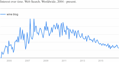
I first looked at the expression "Wine blog" (which will bring up English-language searches only), and hence the title of this blog post. The Trends graphs show changes in the relative proportion of searches for the given term (vertically) through time (horizontally). The vertical axis is scaled so that 100 is simply the time with the most popularity as a fraction of the total number of searches (ie. the scale shows the proportion of searches, with the maximum always shown as 100, no matter how many searches there were).

Google searches for "Wine blog" from 2004-2016

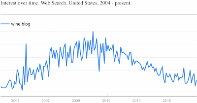
Both worldwide (above graph) and within the USA alone (below), the results are somewhat depressing if you happen to be writing a wine blog — the resulting trends are very consistent over the years, and searches for the term are now only 25% as common as they were in 2010.

Google searches for "Wine blog" in the USA from 2004-2016

Perhaps people already have found the blogs they need, and thus are no longer searching for them, or interest by new readers is declining. I am told that the majority of people still use family and friends for wine recommendations, so writing a wine blog based solely on reviewing wines may be a bit of wasted time. Tom Wark's Fermentation blog attributes this decline to a switch to specialist social media, such as Facebook and Twitter; and Jamie Goode's Wine Anorak blog notes that the move of advertising dollars to these media has had a negative effect on wine writing in general.

Charles Olken, at the Connoisseurs’ Guide to California Wine, has also noted that blogging itself seems to be dying in the wine world. So, I also had a bit of a look at some individual wine-related blogs, to see how each might be getting on through time; but Google Trends rather rudely tells me that "your search doesn't have enough data" for most of them.

So, for comparison we might look at a few wine commentators, instead, to see how they are faring. The obvious first candidate is Robert M. Parker, Jr.

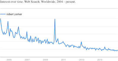
Google searches for "Robert Parker" from 2004-2016

There are a number of people who might be very happy with this graph, as the sport of Parker Bashing is as popular as bear baiting once was. Nevertheless, I think that it is still safe to conclude that Parker's popularity has been waning for quite some time. Either that, or he is so well known that no-one needs to search for him any longer!

Since we can plot a map, we might as well do so. The shading of the map regions indicates the relative proportion of searches originating from that location, with darker shades indicating more searches.

Map of Google searches for "Robert Parker" from 2004-2016

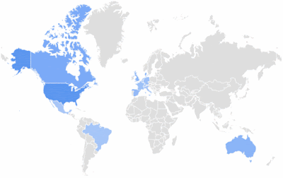
Not unexpectedly, Parker's web searches originate mainly from the USA, although Hong Kong and Singapore also feature strongly. Canada, Australia and western Europe are the other obvious centers of interest. The Chinese apparently do not care much, in spite of their (prior?) interest in Bordeaux wines.

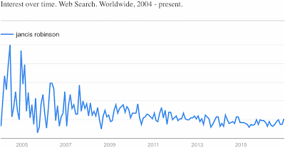
For comparison with Mr Parker (male, from the USA), the obvious choice is Jancis Robinson (female, from the UK).

Google searches for "Jancis Robinson" from 2004-2016

In this case, the searches have not so much decreased in number as become less variable through time. Otherwise, Robinson seems to have maintained a remarkably steady degree of interest over the past 13 years, albeit with a slight decline over the most recent 5 years.

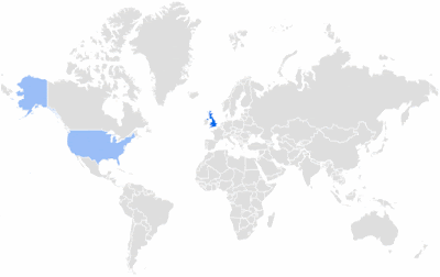
Map of Google searches for "Jancis Robinson" from 2004-2016

However, her map seems to indicate a somewhat restricted sphere of influence on web searches, as her searches have originated almost solely from within the United Kingdom.

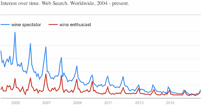
Google searches for wine magazines from 2004-2016

Finally, we can look at a couple of the wine-related publications. The Wine Enthusiast has shown a fairly steady interest on the web, with a small decline over the past 10 years, assuming that web searches for the term "wine enthusiast" are aimed at the publication. However, the Wine Spectator has shown a rather dramatic and consistent fall in interest, so that now there is very little difference in popularity between the two. The Wine Advocate (not shown) has consistently had about one-third as many searches as the Wine Enthusiast; and there is little point in thinking that web searches for "Decanter" will necessarily be targeted at the magazine of that name.

Note that both magazines show a very distinct burst in search activity at the end of each year, just before Christmas / New Year. I suspect that this reflects searches for information about what wines to give wine-interested friends and relatives (and bosses). And rightly so!