Let’s look at a few of the other interesting patterns, here. We might start with the overview, which looks like this:
Clearly, there’s quite a few producers, based on farming quite a few acres. These producers pay quite a bit of federal, state and local taxes, don’t you think? That’s also a lot of tourism visits, which generate a lot (quite nice) of tourist expenditure.
However, I thought that here we might start by looking at some of the data relating to jobs and wages. After all, the people in the wine industry do rely on this, rather a lot.
This first graph shows the relationship between the number of wine-industry jobs per state (horizontally) and the average wage per job (vertically), with each point representing a single state, some of which are labeled. Note that the states with the largest number of wine-industry jobs are California, Texas, Florida and New York, but that the workers in California and New York do much better financially than do their compatriots in Texas and Florida. It is the workers in Mississippi, Wyoming and North Dakota who are paid the least, while those in Connecticut do best of all — those in Massachusetts and New Jersey do just as well as those in California and New York. The fewest jobs are in Wyoming and Alaska, but the Alaskan workers are paid much better.
Moving on, the second graph shows the relationship between the number of wine-industry jobs per state (horizontally) and the number of tourist visits per state (vertically), with each point representing a single state, some of which are labeled. As we might expect, the two sets of data are highly related, as shown by the pink line — they are both dependent on the size of the wine industry in each state. However, Alaska, Hawaii, Louisiana, South Carolina, Nevada and Florida do have fewer visits relative to the other states.
Oregon and Washington are just to the left of New York in the graph (along with Pennsylvania). These states have recently been disadvantageously compared in terms of their tourism budgets (Tourism budget cuts set Washington wines back a decade).
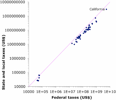
Finally, the third graph shows the relationship between the different types of taxes paid, with once again each point representing one state. Apparently, everyone is treated equally, across the country — the more you pay in one type of tax, then the more you pay of the other tax types, as well. So, it doesn’t much matter which state you are in, the Alcohol and Tobacco Tax and Trade Bureau (TTB) and the myriad state alcohol beverage control boards (ABCs) think that you are all the same. However, the federal taxes considerably exceeded the other taxes in almost all states (that is, the graph points are below the pink line of equality), except two. In Wyoming, the taxes were almost equal, and in North Dakota the federal taxes were slightly less than the sum of the others.
Mind you, local taxes in the US wine industry don’t sound easy (A look at how beverage alcohol businesses are managing compliance):
All the industry sectors surveyed said they have a tough time filing sales tax returns with the appropriate state and local jurisdictions, and they’re challenged when it comes to keeping track of changing state and local sales and use tax rates.For those of you who have not noticed, the US alcohol regulatory system is one of the most complex in the world; and many things change from state to state (and there are 50 of them). The European Union is easier to deal with!
Anyway, clearly California is the number 1 state for the U.S. wine industry (raisin, table and wine grapes represent a key component of the state’s economy). In this regard, you may want to read a summary of the California part of the report: New study provides insight on the economic impact of the California wine industry. Another report specifically for this state is the one on the Economic Impact of California Wine.


No comments:
Post a Comment