Monday, August 27, 2018

Estimates of cork taint from the Wine Spectator Napa office

The Wine Spectator magazine's Napa office tracked the number of apparently cork-tainted bottles in their tastings of California wines from 2005 to 2016, reporting their results at the beginning of the next year. There has been no report on the situation in 2017; and James Laube, who wrote the reports, has recently retired from regularly doing the California tastings (Wine Spectator announces changes in California wine reviewers). So, this could be an appropriate time to review their data.

A corked wine

Each year, all of the bottles tasted in the Napa office were assessed for "off" aromas. For bottles with corks, taint is usually caused by the presence of the chemical trichloroanisole (TCA) in the cork, but there are other potential sources of off smells. For example, the Cork Quality Council also lists 1-octen-3-ol, 1-octen-3-one, and guiacol.

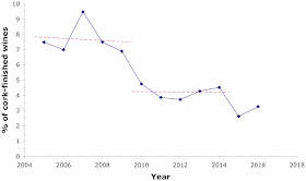
Whatever the source, the data in the following graph refers to the "off" wines as a percentage only of those bottles with corks. Obviously, the data show that the percentage of tainted wines has improved through time.

Cork-tainted bottles in the Wine Spectator tastings of  California wines

Indeed, the trend looks impressively like cork quality is steadily improving. However, as I mentioned in a previous post (Drawing lines through a graph of points — what does this mean?), fitting a trend line to a graph can be a deceptive business. For example, the dashed pink lines in this next version of the graph highlight a different pattern — that tainted wines decreased between 2009 and 2010, but have otherwise remained relatively steady before and after then. Maybe something happened at that time?

Cork-tainted bottles in the Wine Spectator tastings of  California wines

Either way, the cork industry is usually reported to have a much lower estimate of cork failure than is shown in the graph above, typically 1-2 percent. This estimate was clearly not believable 10 years ago, and it is still half of that reported by the Wine Spectator, even now.

The cork manufacturers (mainly in Portugal) have been reported to be getting their act together, to improve the situation (eg. Taint misbehavin’: improving TCA testing methods to ensure cork quality). Improved testing may explain the apparent improvement between 2009 and 2010. The basic issue seems to be getting the cork wood clean, so that it can be turned into wine stoppers. Indeed, the industry is claiming that they will have eradicated TCA by the year 2020.


This raises the point as to why we use corks for wine bottles in the first place. Vidon Vineyard has this to say on the matter:
The main reason corks remain the predominant closure is tradition; change doesn’t come about easily in many fields. As long as one is willing to accept an occasional bad bottle of wine, corks are fine.
In any case, it seems clear that consumers often associate corks with high-quality wines (The effects of wine bottle closure type on perceived wine quality).

Vidon Vineyard's comments raise another important point:
A problem is that much of the time a cork-tainted wine isn’t recognized as such, but is passed off as “just not a good wine”, which means it’s the winemaker’s fault. And oftentimes a slightly tainted wine is consumed as “not too bad”, while if it could be tasted alongside an untainted wine with the same label, the reaction may have been “wow, this is great”!
Given that most wines are drunk within a few months of being released, the idea that we need corks in these particular wines seems to be ludicrous. Apart from anything else, untwisting a screw cap is so much easier!

On the other hand, we might also be concerned about the fate of the Cork Oaks (Quercus suber) themselves. These trees are owned and managed by farmers, who need to make a living from their land. If they can no longer make money from their cork trees, then those trees will be under threat of being replaced by some other crop. According to the Cork Quality Council, 37% of the cork forests are in Portugal (and 27% in Spain), where 50% of the cork production is centered (with 31% in Spain) — so, this is where the effect will be felt. In 2015, wine corks represented 72% of the Portugese cork industry's value, worth €644 million. This is not an inconsiderable industry, which will exert pressure to keep the Oaks.

Monday, August 20, 2018

How long should we cellar our wines?

A few weeks ago I raised the issue of how long we should keep our newly purchased wines, in order to drink them while at their best. Most of us have no idea about how to decide this, so we might seek advice from people who possibly know more than we do. However, it is usually rather hard to do this, unless the actual winemaker has suggested something.

From Wine Folly

This because most wine writers seem to either: make rather generic statements (eg. based on the origin of the wine), or be very vague (eg. short-, medium-, long-term cellaring), or ignore the topic entirely. I don't blame them. There are two parts to the problem of making such a decision: (i) where are the wines being stored? and (ii) why are you storing them? Recently, Tom Maresca wrote a blog post addressing both issues with respect to his own cellar (Tales from the crypt: a cellar story):
Most collectors would scream with horror at such an uncontrolled repository for their wines, but I’m not a collector and never have been ... The wines I’ve stored over the years have been a hodge-podge ... So if less-than-perfect storage conditions meant speeding up their maturation — in effect adding a few years to their calendrical age — that was and is no problem for me. In fact, it’s an advantage, since I have no plans to bequeath a cellar to my heirs and assigns, and I’d like to taste these wines while I still have functioning taste buds.
Well, like Tom, I am cellaring my wines for my own drinking, and my storage conditions are less than perfect. How do I decide when to open each bottle?

Some data

I decided that I would find out what sort of advice I get given. Since few commentators provide the required quantitative information (ie. some actual drinking dates), I ended up falling back on my trusty Australian wine experts (as I have done in previous blog posts).

There are three I found who have, at least in the past, provided a range of actual years that they consider to be the "peak drinking window" for the wines they have reviewed: Jeremy Oliver, James Halliday, and the Wine Front. The first two commentators are individual people, while the third one is a group of three people (Mike Bennie, Campbell Mattinson, Gary Walsh), any one of whom may have provided the commentary.

I have been recording their data whenever I consulted their writings about an Australian wine. So, there is nothing planned about the following data — it is simply whatever wines I have researched over the past couple of years, and for which all three critics have provided a minimum and maximum recommended drinking year. All of the wines are considered to be worth cellaring (otherwise I wouldn't need the data!), and therefore most of them are red (and, coincidentally, none are sparkling).

I got to a total of 111 wines, before I decided to write this post. I checked 194 wines, but only these 111 had complete data from all three sources. The following two graphs summarize the data for these 111 wines. Each of them is a frequency histogram, in which the vertical axis counts the number of wines fitting into each of the categories represented horizontally. The three commentators are shown in different colors.

The first graph shows the actual cellaring ranges suggested by each critic — that is, the number of years between their earliest suggested drinking date and the final suggested date (ie. the length of the drinking window). Note that, since it is the same 111 wines shown for each critic, the three superimposed graphs would be identical if the critics perfectly agreed with each other. Clearly, not only are they not identical, they differ quite a lot.

Frequency histogram of the cellaring ranges

So, there is not much agreement between the three sets of suggestions:
  • Jeremy Oliver's suggestions show two peaks of time (technically, the data are bimodal), with peaks at 4-5 years and at 9 years, presumably representing his idea about short- and long-term cellaring;
  • James Halliday's suggestions are also rather bimodal, but with peaks at 6 years and 9 years — plus, there are a lot of much longer times, as well;
  • the Wine Front suggestions are only slightly bimodal, with most of the suggestions being in the range 6-9 years.
So, it seems that, while the suggestions differ, it is the Wine Front that differs the most — Oliver and Halliday pretty much ignore 7-8 years as a storage time. Furthermore, for one-fifth of the wines there is actually no overlap in the suggested drinking window between: (i) the Wine Front and Jeremy Oliver, or (ii) between Oliver and Halliday. A fat lot of help this is to me, as a person seeking advice!

Now let's look at the data in a slightly different way. The second graph shows each critic's suggested drinking window as a proportion of the total suggested window — that total length is the number of years between the earliest suggested date from any of the critics and the last date suggested by any of them.

Frequency histogram of the cellaring range proportions

James Halliday is often the one who determines the maximum value of the window (represented by the big orange peak at the right), making him the most optimistic about how long the wines will last. Jeremy Oliver's suggestions are often only 40-50% of the length of the total window, while those from the Wine Front are often more than that. So, Oliver's suggested lengths average about 88% of those of Halliday and 82% of the Wine Front's, while Halliday's average is about 27% longer than those of the Wine Front.

This means that Oliver is the most cautious in making his prognostications — he suggests shorter drinking windows. Perhaps he is less optimistic about the conditions under which wine will be stored by most people? Interestingly, Halliday no longer makes suggestions for the upper limit of his drinking windows. Perhaps he has realized that wine-storage conditions make this particular prognostication fraught with danger?

Conclusions

There is not much agreement between the three sources of cellaring information. This matches the situation for wine-quality scores, where disagreements among commentators abound, as I have discussed before.

I can see why most wine commentators refrain from being too precise about how long to cellar any given wine. Not only are they making a forecast about each wine's future development, they have to contend with unknown but probably less-than-ideal storage conditions. This is a pity, because I still have to somehow make my decision, every time I buy a bottle of wine. I can also see why wine-interested people often buy multiple bottles of each vintage — at least one of them might be drunk when the wine is at its peak!

Monday, August 13, 2018

Drawing lines through a graph of points — what does this mean?

The short answer is: it depends on who is drawing the line, and why they are drawing it.

Some time ago I published a post about getting the question right when analyzing data. I pointed out that the question usually leads to the choice of an appropriate mathematical model, which we then use to answer that question. We fit the model to the data (or the other way around), and reach some conclusions from what the model tells us. So, asking the right question will usually tell us something useful.


However, we need to think about the purpose of the model. Are we actually trying to create some model that helps us understand our data, or are we just trying to draw some line through a graph of the data? This is the difference between explaining our data and summarizing it, respectively (see An introduction to data modeling, and why we do it). Here, I will draw some different lines through a couple of wine-related data sets, representing different models, to show you what I mean.

Bordeaux wine production

Consider the following graph, which is taken from the American Journal of Enology and Viticulture 51: 249-261, 2000. It shows the total production of the Bordeaux wine region (vertically) over 60 years (horizontally). Each point represents one vintage.

Polynomial model fit

The authors have added a polynomial line to their empirical data, to illustrate the trend in wine production. The line fits the data quite well, with 89% of the variation in the data being fitted by the model.

This model may well be adequate for the authors' purpose (in writing the paper). However, it cannot be a realistic model for the data. For example, the model suggests that production decreased during the first third of the 20th century — indeed, it implies that wine production in 1905 was the same as in 1995, which is not what happened (see the actual Bordeaux history as discussed by the Wine Cellar Insider).

So, this is simply a "line of best fit" to the data, used as a convenience. It cannot be used to discuss wine production outside the range of years shown on the graph. That is, the line does not model wine production, but merely summarizes the available data.

If we wanted to model the actual wine production, then we would need a model (and line) that shows a small increase in wine production from the mid-1700s until the mid-1900s (since that is what actually happened).

As an example, consider the following graph of the same data, to which I have added two straight lines. One line fits the data until the mid-1960s and the other fits the data from then onwards. This is called a piecewise model (ie. it consists of a series of straight lines).

Piecewise model fit

The two lines of this piecewise model happen to intersect in 1968, which turns out to be the last year in which Bordeaux had a poor vintage. This intersection may thus not be coincidence. Indeed, Pablo Almaraz (2015. Bordeaux wine quality and climate fluctuations during the last century: changing temperatures and changing industry. Climate Research 64: 187-199) suggests that production management in Bordeaux changed during the 1960s, under which circumstances this new model would have some realistic basis.

However, this piecewise also cannot be correct, because it suggests that there would be a continuing increase in production during the 2000s, and we know that this did not subsequently happen. A sigmoid model would be needed, instead.

To illustrate what I mean by this type of model, let's look at the wine production of a single château.

Single château wine yield

This next graph plots some data for an unnamed wine producer, although only Château Latour fits the description given in the American Economic Review, Papers and Proceedings 101: 142-146, 2011. This time, wine production is shown for the 1840s until the early 2000s.


We can see that wine production increased during the 160 years of data, and we could, if we so inclined, fit a straight line as a "best fit". However, this line would fit only 50% of the variation in the data.

A more realistic model would be one that suggests little change in production until the 1950s, and little change in production from the 1990s onwards. Such a model is shown as the thick line in this final graph. Such models are known as sigmoid (the lines are shaped like the letter S) — technically, this one is a logistic model.

Logistic model fit

The model indicates that the long-term average production from 1850-1950 was c. 17 hL/ha. Production then rapidly increased to 45 hL/ha by 1990 (ie. a 3-fold increase). The mid-point of the increase was between the 1967 and 1968 vintages. This model thus fits the conclusions from the piecewise model quite nicely.

However, this model is probably not entirely correct, because it implies that Bordeaux wine production was unchanged in prior centuries, when it probably increased somewhat, from the 1700s.

Discussion

There is a difference between fitting a line to the data (curve fitting) and trying to model the biology represented by the data. Both types of analysis fit an equation to a set of data, which is then visualized as fitting a line to a set of points on a graph. However, curve fitting focuses on finding the best-fitting equation, while modeling focuses on finding a model with a realistic biological interpretation.

Fitting a line is a mathematical procedure of convenience — it summarizes the data. However, the resulting equation may not have much direct biological relevance — the parameters of the model equation need to have a reasonable biological interpretation. In particular, a model should have relevance outside the range of the observed data — if the equation predicts values that are known to be incorrect, then it cannot be a good model for the biology, and nor can it be good if it predicts outrageous unknown values. A fitted curve is relevant only within the range of the data.

It is thus important to understand the purpose the author(s) had fitting the line, because this determines how we interpret the meaning.

Monday, August 6, 2018

Why not expand the 100-point scale?

Value judgments are usually presented on some sort of quantitative scale, with an upper limit of maybe 5 stars or 10 points, or even 100 points. In most cases, the maximum value represents the best quality that the evaluators expect to see.* This leads to a potential problem when someone or something achieves that quality. What happens next, now that we know the maximum can be achieved? What do we do when someone does even better?


For example, at the 1984 Winter Olympics the figure-skating pair of Jayne Torvill and Christopher Dean received maximum artistic-impression scores of 6.0 from each of the 12 judges, which had never happened before (for a single performance). Does this mean that no-one can ever do better? Not unexpectedly, the International Skating Union's International Judging System eventually replaced the previous 6.0 system (in 2004), so that scores no longer get near the maximum possible.

In a similar vein, it has been pointed out innumerable times that the top end of the 100-point wine-quality scale has become unnaturally crowded. This graph of the frequency distribution of some of Robert Parker's wines scores illustrates the issue (taken from my post Biases in wine quality scores). Here, the height of each vertical bar in the graph represents the proportion of wines receiving each score, as shown horizontally.


There is a distinct bump in the graph at a score of 100, indicating that more wines are being awarded this score than would be expected. This is precisely what happens when we reach the ceiling of any quality scale — there are lots of very good wines, and we cannot distinguish among them because we have to give them all the same score: 100.

We probably need to address this issue. Given the large subjective component in such ratings, there are only two general ways to go about this. We either:
  1. re-scale the 100-point scale, thus reducing the quality implication of the scores, so that "100-point wines" no longer get 100 points but instead get a wider range of lower points; or 
  2. go past the 100 limit, and start doling out scores that exceed 100 points.
This raises the question of whether the latter option has ever been chosen. Indeed, it has happened at least once that I know of (and there may be others).

In September 1998, Jancis Robinson posted on her web site a set of quality scores from a vertical tasting of the wines of Château d'Yquem (Notes from attending an Yquem vertical tasting).** The data are shown in the next graph, with the quality scores vertically and the wine vintages horizontally. The first two vintages were the "Thomas Jefferson wines" supplied by Hardy Rodenstock, and so their provenance is considered doubtful.

Jancis Robinson's wine-quallity scores for Château d'Yquem

The quality of the remaining wines is nominally scored on Robinson's usual 20-point scale. Note that three of the wines received a score of 20, while four of them were awarded scores that notably exceed 20 points (marked by the red line). Robinson made no comment about her unexpected scores, but she did use a series of superlatives in her tasting notes, the like of which we do not usually see from her pen (eg. "absolutely extraordinary").

Obviously, Robinson has her own personal quality scale, and what we are presumably being told here is that these wines exceed her usual expectations for a "20-point wine". It therefore seems to me that this is a prime example of option (2) presented above.

As such, the question does now rise as to whether this approach was actually necessary in this particular case. We might find a possible answer by looking at what other people have done when confronted with these same wines.

As one example, Per-Henrik Mansson published a set of quality scores for many of the same wines in the May 1999 issue of the Wine Spectator magazine (Three centuries of Château d'Yquem). He used a 100-point scale for his scores, so I have converted them to a 20-point scale for the comparison shown in the next graph (Mansson's relevant scores are in maroon).

Comparison of scores from Jancis Robinson and Per-Henrik Mansson

The correlation between the two sets of scores is 48%, which is slightly higher than we have come to expect from wine professionals (10-40%). However, Mansson never exceeded the nominal limit of his scale — of the 121 scores in his article, there are four 100-point scores, but none scored higher. Indeed, a comparison of the scores on the 20-point scale shows that Robinson's scores are generally 25% higher than Mansson's, across the board.

I think that we might therefore argue that Mansson has provided an example of option (1) presented above (ie. re-structuring the scale so that we don't bump our head against the score ceiling). Actually, Mansson provided nine scores that are <70 and 30 scores that are <80, so that he used a large part of the score range from 50-100 points (his lowest score is 55). This wide range of scores would be considered very unusual during the 20 years since he published his scores!

As a final note, there are only two vintages for which Robinson and Mansson strongly disagree — Robinson scored the 1931 vintage much higher than did Mansson, and he returned the favor with the 1971 vintage.


* This was not actually true at the undergraduate university I attended. The final (research) year of my science degree was assessed on a scale of 1-20. In this case, 20 points represented perfection, which could not be obtained in practice by anyone, let alone a student. Nor could a student get 18 or 19 points, although these might be obtained by a professional scientist. The best that might be expected for a student was 16 points, in which case the student was awarded the University Medal, which happened only occasionally. The top mark that might regularly be expected (ie. every year) was 14 points. At the other end, 0 points was a fail at the Honours year, which meant that the student would get a Pass award, instead.

** Thanks to Bob Henry for providing a copy of the blog post.